Archive for the ‘Tech’ Category

A Peek Behind the Curtain!

Thursday, February 13th, 2014

I, like many other audiobook narrators, am frequently asked questions like:

  • How do you record an audiobook?
  • What goes into it?
  • How long does it take?

Every narrator gets questions like this and we usually don’t mind answering, because hey- who doesn’t like to talk about their job? But at some point I started to wonder if maybe there was a way to show people what making an audiobook was like?

Watch the Sausage Get Made

So, I pitched the idea of doing a live stream of me recording an audiobook to one of my clients. They loved the idea, and so I’m going to try an experiment to see if this works, and if people are interested. The idea is to give people a look at the ins and outs of making an audiobook- all the stops and starts, the retakes, the flubs (and the occasional cursing), the punching in and all that.

Live Stream Info

On February 14, 2014, starting at or around 10 AM Pacific time, I’ll be streaming a recording session live. Tune in to see me, my microphone, and the software I use to record as I do it. I might even have some commentary for you, in between takes and mistakes! You can watch here or at http://twitch.tv/VoxManVO

Watch live video from VoxManVO on www.twitch.tv

What I’ll Be Recording

I’m going to be recording a textbook entitled A More Perfect Union: An Introduction to American Government and Politics, Part 1, published by Line-In Publishing.

I’d love to hear your thoughts on this. Shoot me a comment here or send me an email (corey at voxman dot net) and let me know what you think!

Web Design Guidelines for your VO Site – Part One

Sunday, April 3rd, 2011

In the voiceover-related discussion forums I haunt, it’s fairly frequent for people to request critiques of their web sites. These sites run the gamut from very slick professionally-produced sites to stuff generated by a free webhost and some templates. I haven’t seen a single one that didn’t break one or more of the rules (they’re more like guidelines) below.

This is the first of a series of posts on this topic. I look forward to your feedback!

My Bona Fides

If I’m going to hand out advice, I suppose I should establish why you might want to listen to me- I mean, everyone and their dog is a marketing expert these days. Me, I’m not a marketing person. I’m not going to build a brand, design a logo or craft an image for you. What I can do is tell you what you should do and should not do when you have that brand, logo or image campaign in mind.

NCSA Mosaic Logo, ca 1994 with world and two arms.

State of the art in 1994. Most users of the web today haven't even heard of Mosaic.

I’ve been building web sites since 1994- since about the time the world wide web as we understand it could be said to exist. Before that I built and ran BBS systems, and before that, well – the technology for home systems to communicate with one another didn’t really exist.

While I am not a graphic designer, nor would I claim to be a visual artist, I’ve been doing this long enough to be able to give you some basic rules for making your web site work for you and your customers- and more importantly, to avoid annoying (or outright ticking off) your customers.

I have watched the web evolve and created content for it from its earliest beginnings of simple pages written by hand in text editors with no control over layout, font, or even color rendered on very primitive software to the rich multimedia experience it is today- and let me just say as an aside that it’s been absolutely fascinating to watch.

However, not everyone will agree with what I say here. I’m OK with that. I don’t have all the answers and it won’t hurt my feelings if you don’t agree with me. This is merely my advice to you, coming from long experience in the world of the Internet and its culture. Take it for what it’s worth, but make your own decisions. Just be sure you know why you’re doing it and what you expect to gain from it.

Rule 1. Flash is not a site

Adobe Flash Logo, a red button with a white stylized "F" inside

Adobe Flash

Flash (formerly by Macromedia, now owned by Adobe) is an animation platform used to add effects to web sites, provide video capability, such as YouTube‘s video player and a lot more. Flash is a great tool for adding some… well, “flash” to your site. I use Flash-based players for my demo reel on my commercial site at VoxMan.net.

There’s a lot of sites that provide so-called “turnkey” solutions using Flash animations as the basis for the entire site. You pick a template, add some graphics and text and you’re off. 

For users, instead of pages you access by clicking on links and getting a new page from a web server, you get one giant Flash animation.  Click a link or button within the animation and it simply changes what you see on the screen instead of getting new content from a web server. Your web browser doesn’t do anything except host the flash animation for you.

So What’s the Problem?

There’s a rather large list of reasons why you don’t want to use a Flash-based site. I’ll give you the big ones.

  1. Not everyone uses Flash. In order for a Flash animation to be displayed, the person viewing your site must have a browser capable of hosting the Flash plugin AND have installed that plugin. For any number of reasons, some people don’t have Flash installed or enabled. Those people can’t see your site.
  2. Apple iPads and iPhones cannot view your site. iOS browsers on the iPad and iPhone cannot display Flash animations. If your site is based on Flash, the only thing someone visiting from an iPad or iPhone will see is a giant ugly message telling them to get Flash, which they can’t do. And they won’t be back.
  3. Flash is not accessible. Anyone who uses assistive software, a screen reader or some other mechanism to browse the web because they have poor or no eyesight will be totally unable to use your site. And they won’t be back.
  4. Flash does not respect the client. The heart of HTML is the concept of separation of content from presentation. That’s why instead of “bold”, you use “strong” and instead of “italic” you use “emphasis”. By describing the content instead of laying it out, clients (browsers) can appropriately present the content according to the user’s preferences or needs. One of the most egregiously bad things Flash-based sites do is simply not resize when the browser is scaled down. If I resize a properly-designed site’s window, the content will be laid out appropriately (within reason). Not so with a Flash-based site, which will simply either float in the middle of your browser on a high-resolution system, or clip past the edges on a lower-resolution one.
  5. You can’t open links in a new tab or window. In any modern web browser worthy of the name, you can right-click (or with Apple systems, hold-click) on a link and be given an option to open the document or resource in a new window. Flash animations don’t let you do that.
  6. You’re adding load that didn’t need to be. A Flash animation must be hosted in a runtime that takes CPU and memory resources on your client. Slowing your (potential) customer’s system down for no good reason is a bad idea.
  7. Flash can crash. Your entire site simply disappears and the user gets a funky error saying the Flash plugin tanked on them. Are they going to be back?
  8. Content hosted in a Flash animation cannot be indexed properly by search engines. Yes, search engines can find the text in a Flash animation now; however the limitations are severe and off-putting to users, who expect when selecting a result to go to that result, which is impossible with a Flash-based site which instead will take them to the homepage or initial screen of it.

There’s a lot more reasons, but even a couple of these should serve to give you pause if you’re contemplating building an entire site in Flash.

Image with Flash logo and text "Get Adobe Flash Player"

If this is all people see when they visit your site, do you think they'll come back?

So What’s the Solution?

Some may think I consider Flash evil- not so! I use it for what it’s good for- animation and multimedia enhancements to an existing web site built in HTML. A small widget with a clickable button that plays my demo reel is a great way to use Flash- although it still doesn’t work on iPad and iPhones or on platforms without Flash support.

Let the tools your customers have chosen- their web browser and operating system- work for you. Use web standards like HTML and CSS to make sure your site is at least functional regardless of how someone chooses to access it. Use Flash to complement your content, not present your content.

Rule 2. Avoid Light Text on a Dark Background

Some sites will create a black or very dark background on which the text is displayed in a very light or white font.

So What’s the Problem?

Large amount of white text on a black background

This is very hard to read for a lot of people

In a word- ouch. It’s very hard to read text on a site using dark backgrounds and light text exclusively. Some of the reasons for this are laid out here, but it comes down to some basics. A big one is that a very large portion of the population suffers from some form of astigmatism- up to 50%. Light text on dark backgrounds is more difficult for them to read. When looking at dark backgrounds, the iris of your eye opens more and this has a couple of effects- first, the white text gets a “halo” effect (compounded in those with astigmatism) and second, when you suddenly go to a site or page with a lighter background you’re half-blind until your eyes adjust.

It’s possible to use a dark background with light text to complement a site’s layout; see this site’s footer and header areas, for example. The problem is when it’s the main theme and everything you read is in that pattern.

 Go visit a bunch of sites you like and browse on a regular basis. How many of them are dark backgrounds with light text for their main “reading” area?

So What’s the Solution?

Obvious, really- use darker text on a lighter background. It doesn’t have to be black on white, it can be (as in the case of this site) dark grey on white, which is very readable.

As with anything, there’s some exceptions- this very site uses white fonts on a grey background in some places. You can do some very nice things with complementary backgrounds; used in moderation dark text on a light background can be a nice complement to a site’s layout. Just don’t use it as your main color scheme.

Rule 3. Make It Clean

Clean, simple, efficient. Learn these words and live them if you want to have a great site.

So What’s the Problem?

Using two clicks when one will do, or using five when zero will work. Fancy themed layouts that don’t convey anything and are simply confusing.

This post is about voiceover artist sites. There’s a lot of good reasons for more complex layouts and navigation structures for other types of sites. Forget about those. That’s not who you are nor do they cater to your customer.

You’re a voice artist. Who is your customer? Your customer is the producer trying to find a great voice for their project. Or possibly the client themselves seeking a voice for their project. They’re looking for a voice to fit their needs, and they have a lot of sites to look at, demos to listen to and you’re not helping them if your site is hard to navigate or uses some cute theme meant to fit your branding that is really just confusing.

These people are busy, they’re under deadlines and they are interested in one thing- hearing your voice. And they want to do it right now.  Don’t make them work for it. Put your demo reel on the homepage or better yet every page on your site.  Make it easy to see how to play it or download it.

Next and just as important- make sure they can contact you without having to look for your contact information. Don’t make them fuss about trying to figure out what the various links do. Have basic contact information on every page in the footer or navigation area, with more detailed info in a separate page they can find easily.

Your site is not a destination. It’s your online business card. Don’t design your site to be a comfortable place to spend hours, any more than you’d design a business card to be read sitting in a comfy chair with a cup of tea.

People who will pay you money don’t spend hours at your site.

 They want to make a choice about whether to pay you money, and your job is to get them the information they need to make that decision. Annoy them with strange layouts, themes and backgrounds, and they’re going to walk away to the next URL on their list to visit.

So What’s the Solution?

Simplicity, Efficiency, Cleanliness. Don’t use two steps where one will do. Don’t make people stop and have to parse your themed layout to figure out what the pulsing neon squid does.

Wrinkle Ridges in Mare Tranquillitatis

Maybe not this sterile. Because that's pretty sterile. (Image Credit: NASA)

Now, lest you believe I am telling you to use a bland, cookie-cutter theme with no personality, sterile as the surface of the Mare Tranquillitatis, nothing could be further from the truth. Just don’t put your theme in front of the content. It’s OK to be memorable, or even cute- as long as you remember that whatever theme or style you choose for your site should support your goal, not detract from it by making it harder to get to the content.

It’s important to have a brand or overall theme of some kind- but you must always remember that you are showcasing your vocal abilities and keep the site focused around that goal.

Rule 4. Avoid Saturated Colors

Saturation in color theory refers to the intensity of a color- a fully saturated color is the most intense version of that color you can get, while a fully desaturated color is grey. This is a very simplified explanation, but it serves for our purposes.

What’s the Problem?

The theory and practice of the use of color can (and does) occupy volumes of scientific literature. The basic issue with use and overuse of color in websites is that color, especially intense color, serves to draw the eye. Some colors are better at this than others, but all use of color for this purpose runs into the problem of desensitization to it. In short, the novelty of a bright color wears off pretty quickly. More fully saturated colors are even more subject to this.

In addition, fully saturated colors are harder on the eye (see rule 2). NASA has some interesting information on the subject.

What’s the Solution?

Rectangle with 100% red at top and a gradient to 0% red at bottom.

Top is 100% saturation, bottom is 0% saturation

Quite simple- avoid use of saturated colors, except in areas of heavy emphasis- and even in those cases, keep it to a minimum. Also, avoid overusing color in general. It’s very easy to create a visual soup that’s really “jagged” feeling when you’re trying to read it. Smoother sites that avoid too much use of sharp contrasts and super-bright colors are more friendly. And no, I don’t mean use all pastels or something, just be consistent and use color that’s easy on the eyes.

Some sites use bright colors extensively; Netflix, for example, uses a saturated red as their background but they at least keep it in the edges of the visual space. Even so I personally find their site obnoxiously bright. My rule of thumb: If you can stare at the site for 5 seconds and look away to see bright afterimages in your vision, you may want to revisit your color decisions.

Rule 5. Links Should Open in the Same Window

When browsing a site and clicking on a link, one of two things will happen- the resulting link will open in the same page or it will open a new window for you, leaving the original content displayed. A very large number of sites do this for any link outside their domain.

What’s the Problem?

Anyone who spends a lot of time with a web browser as part of their job absolutely hates links that pop up a new window. If it’s necessary, you can right-click (or hold-click for Apple systems) and select a new window or tab for the link. This is good- it puts the choice in the hands of the reader.

Opening a new window for every link clicked on is not a good experience. Keeping things in one browser window is more optimal and reduces end-user confusion (and irritation!).

What’s the Solution?

Simple! Don’t use the target=”_blank” attribute in your link tags, or if you’re using an editor, choose “Open in the current window”. Your customers will appreciate it.

All that said, there are some rare cases where you may want to open content in a new window. If your page contains a form and the user navigates away from it any data they’ve entered may be lost, so for context-sensitive help or links in such pages you may be justified in using a link that opens in a new window.

Rule 6. Don’t Disable Right-Click

In a bid to protect their content from people copying and pasting text or saving images to their hard drive, website owners will use various tools to prevent users from accessing the context menu in their browser, thereby (in theory) disabling access to the “save as” or “copy” options. If you’ve ever visited a site and trying to right click it gives you a popup saying “Copyright Protected” or something similar, or if you simply cannot select content on the page with your mouse, you’ve run into a site doing this.

So What’s the Problem?

There’s a lot of reasons this kind of behavior on your site is a bad idea. Here’s a short list.

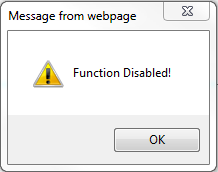
Popup showing text "Function Disabled"

Don't do this to your customers.

  1. You cannot use the context menu. If you disable right-click in your web page your (potential) customer cannot access basic functionality of their browser, including, but not limited to:
    1. Opening a link in a new window or a new tab. Users who spend a lot of time on the web like being able to organize data in tabs while browsing. You’re taking away a basic tool for them.
    2. Copying text. Guess what happens when they can’t copy your phone number or email address to the clipboard? Here’s a hint: It doesn’t end with the word “paycheck”.
    3. Bookmarking your page. I guess you never want them to come back? And yes, they can do it via the main menu but I’ll promise you this: if they don’t normally do it that way, they won’t make an exception for you.
  2. It treats every customer as a criminal. You are basically telling everyone who accesses your site that you expect them to be thieves lusting after your content. The 99.9% of your visitors who only want to use the basic functions of their browser like tabs or copying an email address to the clipboard are given a nasty surprise.
  3. It’s obnoxious and rude. Don’t assert that much control over the user’s browser. It’s not your place. If you don’t want it to be copied or shared, the best solution is not to publish it at all- if you believe you’re protecting yourself from people who want to steal your content, you’re flat wrong.
  4. It doesn’t work. It takes very little effort to bypass a script or tool that disables the context menu. Note that this fact is not a justification for using it! The content has been sent to the user, and you have no control over it once that happens. Disabling these protections for someone who’s intent on doing it is the work of about 10 seconds. The only people you cause problems for are legitimate users.
  5. It doesn’t even slow down ACTUAL thieves. They don’t visit your site with a browser and save your content. Real content thieves are the ones aggregating posts on their sites for the purpose of drawing clicks for ad scams (among other things). You can’t stop them with a technique that relies on a client script because they’re not using a browser. They’re running software that visits your server, sucks down the content and does what they want with it. A chunk of JavaScript that displays “Right-click disabled” does absolutely nothing when the thief’s system doesn’t even use JavaScript. The person who’s going to steal your content is unaware that you tried to protect it. Not exactly good protection, eh?

In the end, using such tools says to your user that you suspect them of malicious intent with no good reason and inconveniences them, again for no good reason. If you are publishing content on the web, it is open for anyone to get ahold of- by design.

So What’s the Solution?

Don’t use tools that promise to protect your content via disabling right-click, obfuscating your site’s source code, using Javascript includes, preventing users from selecting text in the browser window or whatever. They don’t work and they serve no useful purpose aside from annoying potential users.

If you’re worried about people stealing your content, ask yourself this question:

Am I better off publishing this and risking it being copied, or not publishing it at all?

A very simple question, with a very simple answer. If the answer is you would prefer to not let it be copied at all, the answer is simple: Don’t publish it on the Internet, because you cannot protect it. In theory you could use lawsuits, DMCA notices or other legal techniques against someone who does steal your content- and you should know your rights, responsibilities and options in the case that someone does- but in the end you can’t prevent the actual act. You could punish it, but preventing it is  functionally impossible and incompatible with an open Web.

If you’re worried about people stealing your images, you can use a few techniques to protect them. The easiest is to simply watermark them or put a logo on it somewhere unobtrusive. It can be a bit irksome to see that on every image you post, so give it some thought.

 In Conclusion

This is the first post of a series I plan to write over time. There’s a lot of other “guidelines” I think people building a VO site (or any site, really) could benefit from knowing and simply haven’t been exposed to. Thanks for reading and I look forward to hearing your thoughts.


The List of Must-Haves for your Studio

Friday, February 18th, 2011

I’ve been a bit quiet lately, but there’s good reason for it! I’ve been working on a new web site, which I hope to “launch” officially very soon. I also cut a commercial demo reel last week, which should be through post-production shortly.

And of course there was a meeting of the PSVAC, which went very well! It continues to grow, and we’re all as pleased as punch at the return on the time and energy investment we’ve put in.

I’ve also been neglecting my blogroll – bad Corey! I added J.C. Dunn’s blog today, and look for more to be added soon, I have a bunch of blogs I read but haven’t linked here yet.

Speaking of Mr. Dunn, he posted an interesting piece today- A list of “must-have” items for any studio. If you do voice work, go read it, because it’s exactly right. I have another piece to add to his list that I consider invaluable: A dog clicker.

Ostensibly a training tool for dogs, it’s just a little plastic geegaw with a metal piece inside that you can “click” with your thumb. It makes a very sharp snapping noise. When I’m recording long-form pieces, I keep it in my hand or nearby, and if I make a mistake during the read, I pause briefly and click it twice, pause again and pick it up.

Audio Waveform showing a dog clicker used between passages

The dog clicker "snaps" are very obvious.

 Later, when it’s time to edit, I can instantly locate those places I need to make changes, removing the stumbles or whatever. For a keychain widget, it’s invaluable!

Another piece of equipment I’m finding more and more valuable as time goes on is my iPad. I hate working with printed copy as every time I change pages there’s rustling and so forth. What I’ve taken to doing these days is saving the copy as a PDF file and sending it to my iPad. Using an app like Cloud Readers you can even annotate the document with a stylus. A stylus is about 15 dollars at a computer store and worth having.

Now I just set the iPad on my copy stand and any page turns are utterly silent. Bliss.

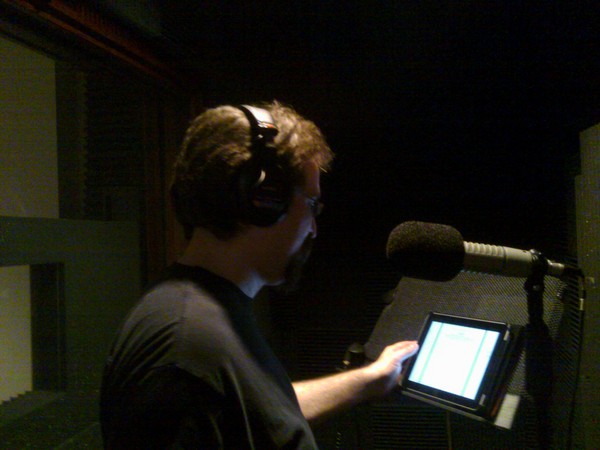
Using the iPad on a copy stand in the booth

Me with the iPad on the copy stand

Your Turn

What do you consider the “must-have” items in your studio?

Setting Up a Phone Patch, Part Deux

Saturday, February 5th, 2011

If you read my previous post about setting up Skype as a phone patch, you may have had some questions.

Spock detects win

Well, make it so!

Well, so did a few others! I’ve been helping Amy Snively (the driving force behind FaffCon!) get her studio set up with a Skype patch. After a few hours on Skype walking her through plugging all the cables in and doing tests of one sort and another, we had win. 

Based on what we learned, there turned out to be a couple of issues with the setup I proposed before. Nothing truly major, but I thought it would be worthwhile to make another post detailing what an on-the-ground setup actually entails and how it worked.

Issues We Ran Into

Here’s some of the things we hit:

Recording and Editing on Separate Systems. Amy uses a different system for recording on than she does for editing. Also, Skype doesn’t run on the recording system, it runs on the edit box.

Playback of Recorded Audio During a Session is Required. My original setup doesn’t support the ability to play back anything you’ve recorded without disabling your ability to hear the other end. Somewhat less than optimal!

The Setup

Here’s what we set up with Amy’s studio, using a MicPort Pro and an Allen and Heath ZED-10 mixer.

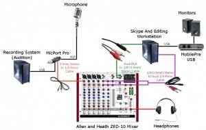
Skype Patch Setup

The Whole Enchilada. Click the picture for a larger version.

The microphone runs to a MicPort Pro, which in turn is the interface used on the recording system. The MicPort has a headphone connector, a 3.5mm (1/8″) standard stereo jack. For this setup, we ran a 3.5mm stereo to 1/4″ mono cable from the headphone jack on the MicPort Pro to the line in on Channel M1 of the mixer.

Next, we connected the mixer to the mic input for the system that Skype runs on. This system in Amy’s case is also her editing system, using an outboard M-Audio MobilePre USB interface. We don’t use that for Skype, but rather the onboard soundcard (the cheap generic pretty much every motherboard sold has built-in). A dual RCA to 3.5mm stereo cable runs from the Monitor Out connections on the mixer to the Mic In connection on the Skype system.

We needed to get sound from the Skype pc back to the mixer, so we took a 3.5mm stereo to dual 1/4″ mono cable and ran it from the Headphone Out on the Skype PC to the Left/Right inputs of the ST1 Channel on the mixer.

To hear what’s going on during recording and to hear the remote party on Skype, the headphones are plugged into the Phones jack of the mixer. The overall volume in the cans is adjusted with the headphone level knob.

The signal coming in to Channel M1 of the mixer is the combination of the monitor and any playback from the recording PC. Channel M1 should have both the Record and Listen buttons punched on- on many other mixers this would be like having the Mute/Alt 3-4 button punched off (thereby sending the signal to the main bus). The level of the signal from the recording system can be adjusted with the fader knob.

The signal coming in to Channel ST1 of the mixer is what’s coming from the other person(s) in your Skype call. The level of this can be adjusted with the fader knob on that channel. It’s critical that the Record button be OFF, while the Listen button be on, or the remote party will hear a loopback of their own audio and you’ll have feedback. For other mixers, this would be the equivalent of setting the Mute/Alt 3-4 button punched to on, thereby sending the signal to the secondary bus.

The overall signal sent to the Skype system can be managed with the Monitor Level knob. The Monitor Source switch must be set to Mix, or there will be a feedback loop for the Skype user on the other end.

For this setup, once the live recording is done, people on Skype hang up and the files are transferred to the editing system. To prevent problems with feedback, the Record button on the M1 channel should be punched to off, or the mixer should be turned off or the Monitor Level knob turned all the way down. Otherwise the signal from the microphone can be routed to the editing system and back to the mixer through the monitor speakers, resulting in nasty feedback.

Scenarios and Settings

I want to mute the other people on Skype. Punch the “Listen” button off on Channel ST1 or turn down the fader on it.

I want to keep the people on Skype from hearing me while I talk to someone else. Punch the Record button to off on Channel M1 or turn the Monitor Level knob all the way down.

I use a different interface for recording, not a MicPort Pro. If your interface has a 1/4″ headphone output you can get a 1/4″ stereo to 1/4″ mono cable, or you can run from the line outputs of your interface to the line of the mixer. If you have specific equipment questions, post them in the comments and I’ll offer what suggestions I can.

Setting Up a Phone Patch

Saturday, January 22nd, 2011
Microphone
How do you get this to work with a phone? (Credit: Michael Rhys)

In this post I’m going to describe how you can set up a simple remote phone patch which allows a remote client to work with you in realtime as you record. This type of setup is invaluable for any voiceover artist working out of a home studio.  

Once you’ve set up your studio with this configuration a remote engineer/producer can call you on the phone, you will hear them in your headphones and they will hear your voice from your VO microphone. You record your audio to your local system as normal while they can provide direction and feedback. The remote audio isn’t recorded, just as though the engineer was in the next room and talking to you in your cans.  

Cool, huh? Let’s get started. A quick note: The instructions in this post are excruciatingly detailed. I broke down everything into basic details and provided a lot of background information, so it may seem longer than it should be. I also assumed you have little or no technical background, so some of this may already be stuff you know.  

Disclaimer: I’m not responsible if you can’t get this to work or if you break your equipment trying to do so. Nothing described here should be risky to any decent audio equipment but anything you do based on this post is at your own risk. 🙂  

I’m here, he’s there!

In the modern voiceover world, the voiceover talent is often not in the same location as the customer. You may find yourself in Seattle doing a recording for someone in Los Angeles, for example. In such a situation, how do you work closely with the producer and engineer as you might do in a studio?  

Normally, when you’re in a recording studio, the engineer and producer park it at the mixing board and can listen to what you’re saying. You’ve got headphones on so they can talk to you to provide direction and feedback. Not exactly practical when you’re 1500 miles apart!  

Many technologies exist to address this scenario- some more expensive than others. The setup I describe here is quite easy to do with most home audio recording setups using the kind of gear you’d find in a home VO studio.  

The Ingredients

Here’s what you’ll need to use this type of setup. Depending on what gear you currently have you may have other options- feel free to hit me up in comments for suggestions on your setup.   

The Computer

You will need a computer with onboard sound- doesn’t matter if it’s a Mac or a PC, as long as it has its own audio inputs and outputs. This may or may not be the PC you do your recording on, you can just as easily do this with two PCs. It does have to have an unused set of audio connections- a mic input and a sound output. This is the system you’ll be running Skype on. If you have a second system for your recording, don’t make any changes to that.  
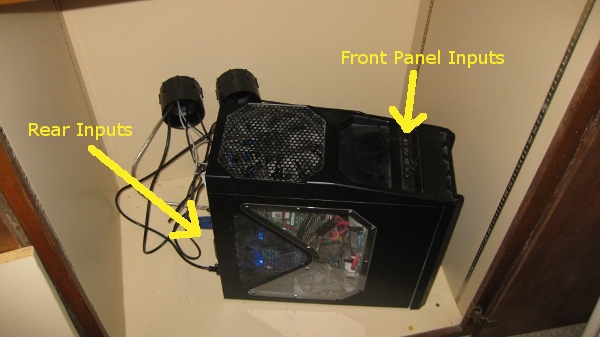
My Computer With Audio Connections Highlighted

Most PCs have more than one set of inputs.

 Here’s a picture of my system, which you can see has two sets of audio jacks (well, you’ll have to take my word on the ones in the back). I use the set on the front for my normal headphone/mic combo, which is what I use for gaming and just normal use- I don’t use that headset for any voice recordings (but it’s great for playing Team Fortress 2!). The rear jacks are hooked up to my mixer, allowing me to listen to Skype calls while recording separately.   

The Mixer
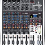
Behringer Xenyx X1204 USB

Behringer Xenyx X1204 USB

The next thing you’ll need is an external mixer with: aux send(s), a stereo input channel, a second bus (sometimes referred to as an alt bus) and a USB/FireWire output to your system. Some examples of mixers you might use are the Behringer Xenyx X1204, the Allen and Heath ZED-10, and the Mackie Onyx 820i Firewire mixer. This is by no means an exhaustive list and many other options exist.  

I personally use the Behringer X1204 Xenyx USB, pictured to the left. Any of the ones I’ve mentioned, or any mixer with a digital interface, aux sends and an input channel supporting stereo input will work.  

Cables

You’ll need cables to connect your mixer and soundcard. For most configurations you will need these two cables:  
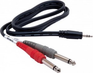
3.5mm Stereo Male to Dual 1/4" Mono Male Cable

3.5mm Stereo Male to Dual 1/4" Mono Male Cable

  A 3.5mm Male Stereo to Dual Mono 1/4″ Male Cable. It looks like the picture on the right. It might or might not say TIP and RING on the dual ends, but it can be helpful for making sure you get the left and right stereo channels correct. Ring/Red is right, Tip/Grey is left.  

This cable will be used to connect your Skype audio output to a secondary channel on your mixer. Because of this it’s important that your mixer have a stereo Line In channel. On most mixers there will be one or two channels like that. It’ll usually have a name like LINE IN 5/6 or LINE IN 7/8. Note that your main mic/instrument channels are mono and you can’t simply plug a stereo signal into them.  
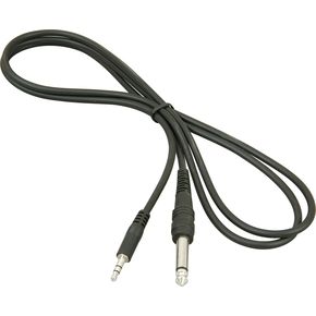
3.5mm Stereo to 1/4" Mono Patch Cable

3.5mm Stereo to 1/4" Mono Patch Cable

A Male Mono 1/4″ to Male Stereo 3.5mm Cable. It looks like the picture on the left. Make sure it’s mono on the 1/4 end and stereo at the 3.5mm end. This cable is what we run from the Aux Send on your mixer to the mic input on your PC. 

Both of these cables are available in any audio store or your local music shop, and come in varying lengths and prices. You don’t need to spend a huge amount of money on these- they’re going to be carrying a telephone-quality signal, so don’t go buy some uber-expensive supercables or something.

Make sure the cables are long enough, though! Nothing’s more frustrating than not having enough cable to run from your PC to the mixer. So measure your distance or at least eyeball it before you buy the cables.

You can find both of these cables online as well- the 3.5mm(1/8″) stereo to 1/4 mono is here, and the 3.5mm(1/8″) stereo to dual 1/4 mono is here. (these are just sample links, I’m not endorsing the website in question, and you can find these all over if you dig around)

 Software

Skype Logo

Skype

 You’ll need a Skype account (optionally with a phone number) and the Skype software, plus whatever software you normally use for recording. You could theoretically use any VOIP software that can accept phone calls to your system- I only provide instructions here for Skype but feel free to try other VOIP solutions if you prefer!  You have various options for your Skype account, depending on whether you want to have a phone number that people can call or only wish to be able to dial outbound to phone numbers.  

Of course, if your remote engineer/producer is on Skype, it’s moot- you can just do a direct Skype call. Win!  

Running the Cables

Make sure your mixer is turned off for now.  

 Take the 3.5mm stereo to 1/4″ mono cable (the one with one plug at both ends) and locate the port on your mixer marked Aux Send or Aux Sends. You might have two of them, or one might be labeled FX Send. If you have an Aux and FX Send, use the Aux one.

Here’s the Aux Sends on a Behringher Xenyx series mixer. This is on the upper right portion of the mixer. Plug your cable into the top one.  
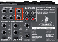
Aux Sends highlighted on a Behringer Xenyx X1204 mixer

The Aux Sends on a Behringer Xenyx X1204

Here’s the Aux Sends on a Mackie Onyx 820i.  
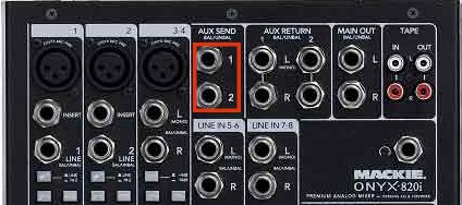
Aux Sends on an Onyx 820i

Aux Sends on an Onyx 820i

Here’s the Aux Send (there’s only one) on an Allen and Heath ZED10.  
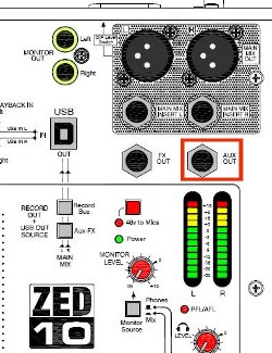
Aux Send on the ZED 10

Aux Send on the ZED 10

 As you can see, varying mixers tend to have the same or very similar names for the inputs and outputs. If you’re using a different mixer and it’s not immediately obvious where the Aux Send is, check your documentation.  

Once you’ve located the Aux Send on your mixer, plug in the 1/4″ (mono) end of the 1/4″ mono to 3.5 mm stereo cable into it. Next, run the cable’s 3.5mm end to your PC and plug it in to the microphone jack you’re planning on using. This might be on the back of the computer if you want to use the secondary connections on your system (I use the primary ones on the front for other stuff, personally).  

Now take the other cable- the 3.5 mm stereo male to dual 1/4″ mono one and locate your mixer’s Line In 5/6 channel or its equivalent. It might have a name like Stereo Input Channel or ST 1 or other names depending on your mixer. Most mixers have several instrument/mic inputs and one or two “line” inputs which instead of a mono signal like you get from a mic or guitar, have a left and right channel. That’s what you’re looking for. 

Here’s the Line In 5/6 channel on the Behringer Xenyx X1204.  
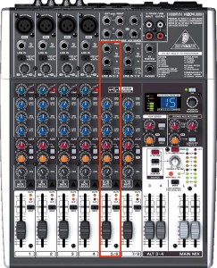
The Line In 5/6 Channel on a Behringer Xenyx X1204

The Line In 5/6 Channel on a Behringer Xenyx X1204.

Here’s the Line In on the Onyx 820i.  
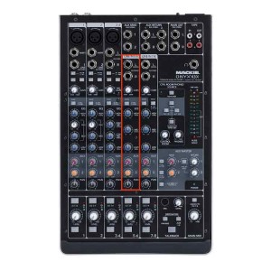
The Line In 5/6 Channel on an Onyx 820i

The Line In 5/6 Channel on an Onyx 820i.

Here’s the Stereo 1 channel on the ZED10.  

Stereo Channel 1 on a Zed 10

Stereo Channel 1 on a Zed 10.

 You should consult your mixer’s documentation if you can’t easily determine which channel to use.  

Plug your two mono connectors- they may be labeled TIP and RING and they may be colored red and grey/black/white. The one labeled TIP and/or colored red goes in the right channel, the one labeled RING and/or colored grey/black/white goes into the left channel.  

Run the 3.5mm end of this cable to your PC and connect it to the headphone jack you plan to use. This might be on the back or the front depending on your system and your needs. I suggest you use the partner of the one you’re using for the microphone- that is, if you’re using the rear mic jack, use the rear headphone jack.  

Adjusting the Mixer Settings

This part is pretty important, so read it carefully. If you get these settings incorrect you either won’t hear anything or you’ll hear a lot more than you wanted to- or worse, you’ll blow out the eardrums of your partners on the phone with you. Feedback sucks.  

We need to set your mixer to do a few things: Send a part of your normal recording input to the Aux Sends. This will pipe a portion of the signal from your expensive condenser mic or whatever you use for your voice recording to the mic input on your PC. We’ll also need to make sure the return signal is at a proper level and that it’s routed so that you can hear it on your headphones but it doesn’t go to the mix output.  

Easy enough- read on!  

Setting the Aux Send Levels
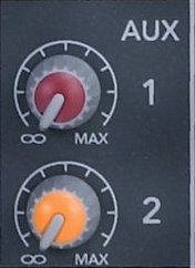
Aux Send Knobs

Aux Send Knobs (Onyx 820i)

 On the channel you pipe your mic or preamp into, locate the knob labeled Aux Send, Aux, or similar. Turn this to about 25%- that’s just a starting point, we’ll adjust it below when we play with Skype. If your mixer provides an FX Send and you don’t use any external effects processor (and if you do, you’re probably not needing to read this tutorial!), turn it down.  

On the Line In 5/6 or Stereo channel- the one you ran the two 1/4″ mono jacks to in the previous step- locate a knob labeled Aux, Aux Send or similar. TURN IT ALL THE WAY DOWN. If there is an FX Send knob on this channel, turn it all the way down also. If you have the Aux Send turned up at all on this channel, you’ll be sending the returned audio from Skype right back to it! That leads to feedback, distortion and pain.  

Setting the Return Levels and monitor

On the channel you sent the output from your PC to- that’s the Line input where you ran the dual-ended cable- we’ll need to make some settings. If your mixer has a level button for the channel (the Behringer Xenyx, for example) set it to the lower option- in my case I use the “up” position which is -10. For other mixers you may have a gain knob. Set it to 0 gain for the time being.  

Next, set the channel to the alt/mute bus. On some mixers you’ll have a button labeled MUTE ALT 3-4 while on others there may be two buttons like Record and Headphones. Make sure the mute button is selected, or if you have two buttons, that the Record one is off while the Headphones/Monitor one is on. This makes it possible for this channel to be heard in your headphones while not being sent to the output!  

Lastly, your mixer probably has a few buttons next to the monitor gain knob. They should have names like MAIN MIXALT 3-4 and possibly USB/Firewire. These buttons determine which “buses” are sent to your headphones. You’ll want to hear both the main mix and the alt bus. If you’re uncertain check your documentation or post a comment below and I’ll see if I can offer any assistance.  

Note: If your mixer has a global gain knob for the Aux Sends (the Behringer does, for example), set it to 0 (zero)- that’s NOT all the way down, that’s in the center for most mixers. 

A Quick Note about Windows and Audio Devices

You may need to tweak your Windows settings for your soundcard to enable extra inputs on your PC- sometimes they’ll be disabled or not useable until you’ve made the proper settings. Unfortunately there are so many possible combinations of these that I can’t tell you exactly how to check yours- in general you can right-click on the speaker icon in the task bar and explore the settings.

If you find yourself stuck and think your Windows settings might be the culprit, drop me a note and I’ll try to provide what assistance I can.

Configuring Skype

Next we’ll set up Skype. We’ll connect Skype’s audio input and output to the mixer’s aux sends and stereo inputs, respectively.  To do this you’ll need to set up your system as though you were going to record. So now you should power up your preamp, your mixer and all your goodies. Get the mic positioned so you can use it while sitting at the system you use Skype on while we do these tests. 

Open the Skype software and click Tools, Options…   
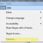
Skype Tools Menu

Select Tools, Options

 On the Options dialog, locate the Audio Settings button on the left.   
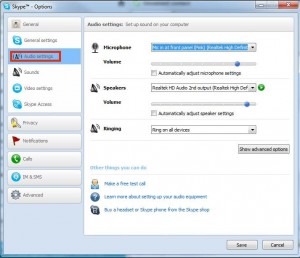
Skype Audio Settings Dialog

Select the "Audio Settings" button on the left

 Setting the Skype Mic Level

Next we need to select the proper audio input by picking a “microphone” for Skype to listen to.  

Skype Mic Selection Dialog

Choose your audio input

 You can select from a list of whatever audio inputs your system supports here. Your list will vary from what mine shows here, and you may find that it’s not easy to figure out the right one. Some systems will be much more descriptive- as you can see, mine says very clearly where the mic input is and even describes the color of the connector on the computer’s case.  

You should select the mic input that corresponds to the input you plugged the Aux Send from your mixer into. Once you do this, the bar underneath should show activity when you speak into the mic. I suggest turning off the “automatically adjust” option and just setting the blue dot so the level is about 3/4 up the slider when you’re speaking in a normal tone.  

Not seeing anything happen? No problem! First, check that your mic is on and and all that- confirm that your mixer is sending audio by doing a quick test recording. Next, double-check the mic input you selected.If you’re seeing the bar move when you speak but it’s too low, you can turn up the gain by adusting the Aux Send knob on your mixer’s mic input channel- remember how you set it to about 25% before? Turn it up until you see your voice peaking at about 75-80% on the meter. You can also use the blue button on the gain bar to adjust the volume once it gets to Skype. 

If you’re still not seeing anything, check your PC (the one you use Skype on) and make absolutely certain you’ve got your cables connected to the proper connections. Many PCs have a plethora of audio jacks, making it easy to get your mic/speaker cables swapped or simply connected to the wrong jack. Consult your PC’s documentation if necessary to verify the position of your mic and speaker jacks.

If you’re seeing the bar “pegged” with solid green or it’s constantly active, like it’s picking up every little noise, you can turn the gain down on the Aux Send to compensate or lower the gain in Skype by moving the little knob to the left.

Skype Speaker Dialog

Skype Speaker Dialog.

 Below the microphone settings is a drop-down to select the speaker Skype should route output to. Select the output you connected the Line In channel on your mixer to. This will cause Skype to send its audio output to your mixer, where you can hear it.  

Once you’ve selected the appropriate connection, make sure you’ve got your headphones on and hit the green test button- if you’re configured correctly you’ll hear the Skype ringtone play in your headphones. If it’s too quiet, adjust the volume in Skype or turn up the gain for the Line In channel on your mixer. If it’s too loud, do the reverse.  

If you don’t hear anything, no problem! Check that you chose the right connection in the output. Also make sure you’re monitoring that channel on your mixer, and make sure that the monitor/headphones options on your mixer are set to send the alt bus to your headphones.  

Once you’re happy with the settings, select the Save button on the lower right of the options dialog to return to Skype.   

Putting It All Together

Here’s where Skype really comes into its own. You can adjust your settings and levels without having to get someone to call you by using the Skype Call Testing Service.  

In your Skype contacts you should have the Echo/Sound Test Service listed. Set yourself up as though you were going to record- pretend that the call test service is your engineer or producer and phone it up.  

You’ll hear a woman with a British accent welcome you to the call testing service. Adjust the gain on your Line In channel to your taste- this is how loud your remote partner will sound to you in a real call.  

After a moment you’ll hear a beep- you’ve got about 5-8 seconds to record a few words for posterity. Just speak as though you were recording some copy. When the beep happens again, you’ll hear the audio you recorded played back- this is where you can hear what it will sound like to your remote partner, which allows you to tweak it for greatest quality and optimal sound levels BEFORE you call someone and they complain you’re blasting their eardrums out of their head.  

You can make as many calls to the Skype call test service as you like, and I suggest doing it until you’re happy with the results. I also suggest recording locally as though you were cutting a real track for someone while you’re on the line with the Call Test Service- make sure that on the final recording only your voice comes through, while Skype is only routed to your cans.  

Conclusion

With this setup you can call someone or have them call you via Skype- and even use a real phone number if you pay Skype for it (I do), and your engineer can hear you as you record, provide you direction and feedback and when you’re done you just take the audio you recorded locally and send it on over. Cool, no?  

I hope this little tutorial was helpful! Please let me know if you have any suggestions, questions or criticisms in the comments below- if I missed something or you think something could use clarification, etc, I’d love to hear about it. Also, I’m happy to answer what questions I can about your setup.

Links

Here’s a list of all the product links in the article.

Credits

The Neumann U87 photo at the top of this post is copyright © by Michael Rhys and used under a Creative Commons license. See his other photos here:  http://www.flickr.com/photos/michaelrhys/40428909/

The Voiceover Wiki

Tuesday, November 23rd, 2010

Voiceover artist Mahmoud Taji recently announced the creation of The Voiceover Wiki. It’s a wiki site dedicated to the world of voiceover and from my so-far brief perusal, has a lot of promise. I’m looking forward to seeing what comes out of it, and probably contributing some myself.

Good stuff, Mahmoud!

The Sound of Silence

Thursday, August 5th, 2010

As I posted earlier today, I was working on reducing noise levels in my office cum studio. And boy, did I ever.

I wanted to get my computer moved out of the room where I do my recording, but needed a way to actually still use the thing. I ripped an old wall heater out, got a hole saw and punched some holes into cabinets that line the wall on the other side.

From there I put in some ABS pipe bushings- basically I went to the hardware store and grabbed a couple of fittings the right size- to provide a cable run and moved the PC into its own space where the noise it makes won’t be in here.

I’ll just let the results speak for themselves, shall I?

Before moving the PC out:

[audio:http://cyclometh.com/wp/wp-content/uploads/2010/08/backgroundnoise_before.mp3|titles=Ambient Noise – Before]

After moving the PC out:

[audio:http://cyclometh.com/wp/wp-content/uploads/2010/08/backgroundnoise_after.mp3|titles=Ambient Noise – After]

What did I learn? Well, the PC was a HUGE source of background noise. After removing it, the recording is practically noise-free. There is a tiny bit, but I think that what I’m hearing is from the sound card itself, which is why I’m glad I have an external soundcard on my “to purchase” list. It’s interesting that removing one source of noise reveals another one that was totally hidden before.

With the amount of noise on the recording, I can effectively eliminate noise entirely from my recordings with a minimal amount of processing, resulting in a far higher quality final product.

The main problem with noise in your recordings is that you can use a noise removal tool like the one in Audacity, but it reduces the overall quality and can really only effectively work when you’re not speaking. When you are speaking, the noise will still come through a bit, but is “drowned out”. The lower the noise floor the better your final product will be.

Oh, and pics!

Cable runs from the studio side. I still need to put in a cover.

Cable runs from the studio side. I still need to put in a cover.


The cabinet with a detail of the cable runs.

The other side, showing one of the cable runs and a corner of the PC.

The Beast in its new home

The Beast in its new (and quiet!) home.

Creating a Noise-Free Studio

Thursday, August 5th, 2010

One of the challenges that any person working with audio faces is recording in a noise-free environment. Ambient noise, especially with a really sensitive microphone (like mine), can really have a negative effect on the quality of your final recording.

White Noise

Whether white, pink, brown or rainbow, noise is your enemy

The trick is to do your recording in an environment that is as “sound-dead” as possible. You want two things:

  1. No external noise sources. Any noise coming in from the outside must be dampened or preferably eliminated entirely. I’ve found that even sounds I can’t normally hear come through as clear as crystal when I turn on the monitor headphones. Someone watching TV or chatting in the next room? I can’t normally hear them at all, but when I have my headphones on monitoring the mic, I can hear everything. The best ways to get rid of noise from outside sources? Don’t have any! Turn off the TV, etc. I put a quilt on my door to dampen ambient noise from the rest of the house or outside- like my neighbor, who’s a professional trumpet player (and very good, too!).
  2. No internal noise sources. This one is often a lot trickier, and it’s one that I’m still wrestling with. The problem that many of us who are trying to do quality voice recordings face is that we use computers to do the actual recording; preamps and microphones are silent but a computer is anything but. Computers have fans- usually many of them- and are a major noise source. Even a “quiet” one makes enough noise to make getting a quality recording a major challenge.

In my case, I have a basement room in my home that I’m using as my office and studio. It’s very nearly perfect, as it has cement walls on two sides backed by dirt. One of the other walls faces into the rest of the basement and has a set of cabinets full of both dead space and junk that does a great job absorbing noise. The fourth wall has a closet, once again full of junk and dead space.

The biggest sources of external noise in my studio, in order: 1) The door. Thin lauan doors don’t do a great job of stopping noise. 2) The ceiling. The floor above is not very thick and noise from that direction is a challenge. I combat it by recording when people are asleep or not in the area of the house above me. Since it’s a bedroom, that’s usually not a big problem.

Yes, it has six fans. Actually seven if you include the big one on top.

The biggest source of internal noise in my studio: The computer. It’s a pretty big beast, with a high-end graphics card and a 1600mm(!) fan on top- it’s a little smaller than a dinner plate. Also multiple fans in front and back to keep the drives and graphics cool. Not a quiet machine by any stretch.

(as an aside, the Antec 900 case is great if you want a great case that keeps your system cool)

I’ve had plans for a while to build a sound booth, so I can isolate my recording environment from the computer. That’s still on the agenda, but I realized something that would be 1) a lot easier, 2) a lot faster, and 3) a TON cheaper.

That wall I mentioned that faces onto the rest of the basement with the cabinets on the other side? Well, the cabinets are big enough for a computer. I had considered moving the computer into the cabinet and punching a hole in the wall for cabling, but that seemed excessive and damaging.

I had forgotten that there was already a hole in the wall facing the cabinets. See, when this house was built, an in-wall heater assembly was installed. I shudder to think about what a fire hazard that thing was. See the pics below for what I mean. Since this heater was installed in the wall facing the cabinets, removing it would mean all I’d need to do is cut a very small hole in the back of the cabinet and voila! No computer noise in the studio!

The wall heater was installed in an inset box and removing it would mean shutting off the power to the entire house (or at least the downstairs, which is pretty much 2/3 of the place anyway) while I worked on it. I was trying to figure out when I could do this and not disrupt my family’s life…

When the power failed.

I was working from home and the power goes out for no reason I can figure- nice sunny day, no wind… hm. Call the electric company and they tell me it’s because of “equipment failure”, which I guess means all those Washingtonians who melt in heat above 70 degrees F turned on their AC and blew up a transformer.

So, opportunity knocks! I can’t do any work without the PC, and I wanted to yank the thing, and do that I needed the power off. So I turned off the main breaker as a precaution to the power coming back on before I was done and yanked the deathtrap heater out of the wall.

Heater removed from wall

What I can’t believe is that anyone would install that in a wall. I never used the thing and took the knob off right after we moved in so no one else could either. Just looking at the thing scares me; it’s like looking at a dead animal that you know can’t hurt you any more but still freaks you out.

The wires in the back are the original power and ground wires. They still run to the rest of the room so I had to put (new) wire nuts on them after disconnecting the heater (I know what I’m doing, please don’t do stuff like this if you don’t).

About 10 minutes after I was done, the power came back on! Serendipity, thy name is Puget Sound Energy.

In the back of the hole in the wall you can see a beige panel- that’s the backing panel for the cabinets on the other side of the wall, and about 1/8″ thick. So the next step will be to cut a hole in that and put in a conduit/box of some type that will leave it looking nice.

For the interior, I’m simply going to rip the face off the old heater cover and use that. It’s already got a nice round face that will be perfect for running cables through, with nicely smoothed edges so it won’t cut anything and it fits on the hole already!

So that’s this evening’s project- shouldn’t take more than 20-30 minutes tops and then I’ll have a MUCH quieter studio for recording in. I’m really looking forward to hearing the difference and not having to mutilate my recordings via aggressive noise removal.

I’ll post some sample recordings before and after the changes to give people an idea of how much I eliminated noise-wise.

P.S. Look, people- if you’re going to do any work on your house, office, whatever, that involves working with electrical systems or components, then you damn sure better know what you’re doing or hire someone who does. Don’t take chances!

WordPress on Microsoft SQL Server!

Sunday, August 1st, 2010

As part of establishing this blog, I wanted to run WordPress for it. I’d used WP in some other situations and really enjoyed the ease of use and flexibility it provided. However, WordPress has never put out a version that will run on Microsoft SQL Server, or any database system other than MySQL.

My website host doesn’t support MySQL any longer, as they are a primarily Microsoft-oriented hosting provider. Given that I’m a developer specializing in Microsoft-based technologies, it seemed a good fit- and still is. As an aside, I recommend checking out DiscountASP.net if you’re in the market for a good hosting provider that supports Microsoft tools and technologies really well.

Wordpress LogoUnfortunately, this left me in a bit of a quandry. No MySQL=No WordPress. Or so I thought. Knowing what I know about SQL databases, I figured there must be someone who has found a way to make WordPress work on SQL Server. Lo and behold, it was true- and it wasn’t just some guy who whipped up a patch, it was Microsoft itself! I give you the WordPress on Microsoft site. The install took literally about 3 minutes. The platform supports SQL Server, SQL Server Express and even SQL Azure. The project looks to still be pretty new but I expect good great things.

There’s been a few minor bugs; I can’t use the Twitter integration plugin as it causes a ton of SQL errors, and some of the URL rewriting for permalinks is not working correctly. Also, support for WordPress 3.x is not available yet, which isn’t surprising given that WP 3.0 was only released a few days ago.

All that said, I’m incredibly pleased that this initiative exists and is supported by Microsoft. Bringing one of the best blogging packages and one of the best database servers in the world together? Can’t go wrong there, and it means that I don’t have to switch hosting providers, use a blogging package I don’t like or have to roll my own DB patch to make WordPress work on SQL Server.