In the voiceover-related discussion forums I haunt, it’s fairly frequent for people to request critiques of their web sites. These sites run the gamut from very slick professionally-produced sites to stuff generated by a free webhost and some templates. I haven’t seen a single one that didn’t break one or more of the rules (they’re more like guidelines) below.
This is the first of a series of posts on this topic. I look forward to your feedback!
My Bona Fides
If I’m going to hand out advice, I suppose I should establish why you might want to listen to me- I mean, everyone and their dog is a marketing expert these days. Me, I’m not a marketing person. I’m not going to build a brand, design a logo or craft an image for you. What I can do is tell you what you should do and should not do when you have that brand, logo or image campaign in mind.

State of the art in 1994. Most users of the web today haven't even heard of Mosaic.
I’ve been building web sites since 1994- since about the time the world wide web as we understand it could be said to exist. Before that I built and ran BBS systems, and before that, well – the technology for home systems to communicate with one another didn’t really exist.
While I am not a graphic designer, nor would I claim to be a visual artist, I’ve been doing this long enough to be able to give you some basic rules for making your web site work for you and your customers- and more importantly, to avoid annoying (or outright ticking off) your customers.
I have watched the web evolve and created content for it from its earliest beginnings of simple pages written by hand in text editors with no control over layout, font, or even color rendered on very primitive software to the rich multimedia experience it is today- and let me just say as an aside that it’s been absolutely fascinating to watch.
However, not everyone will agree with what I say here. I’m OK with that. I don’t have all the answers and it won’t hurt my feelings if you don’t agree with me. This is merely my advice to you, coming from long experience in the world of the Internet and its culture. Take it for what it’s worth, but make your own decisions. Just be sure you know why you’re doing it and what you expect to gain from it.
Rule 1. Flash is not a site

Adobe Flash
Flash (formerly by Macromedia, now owned by Adobe) is an animation platform used to add effects to web sites, provide video capability, such as YouTube‘s video player and a lot more. Flash is a great tool for adding some… well, “flash” to your site. I use Flash-based players for my demo reel on my commercial site at VoxMan.net.
There’s a lot of sites that provide so-called “turnkey” solutions using Flash animations as the basis for the entire site. You pick a template, add some graphics and text and you’re off.
For users, instead of pages you access by clicking on links and getting a new page from a web server, you get one giant Flash animation. Click a link or button within the animation and it simply changes what you see on the screen instead of getting new content from a web server. Your web browser doesn’t do anything except host the flash animation for you.
So What’s the Problem?
There’s a rather large list of reasons why you don’t want to use a Flash-based site. I’ll give you the big ones.
- Not everyone uses Flash. In order for a Flash animation to be displayed, the person viewing your site must have a browser capable of hosting the Flash plugin AND have installed that plugin. For any number of reasons, some people don’t have Flash installed or enabled. Those people can’t see your site.
- Apple iPads and iPhones cannot view your site. iOS browsers on the iPad and iPhone cannot display Flash animations. If your site is based on Flash, the only thing someone visiting from an iPad or iPhone will see is a giant ugly message telling them to get Flash, which they can’t do. And they won’t be back.
- Flash is not accessible. Anyone who uses assistive software, a screen reader or some other mechanism to browse the web because they have poor or no eyesight will be totally unable to use your site. And they won’t be back.
- Flash does not respect the client. The heart of HTML is the concept of separation of content from presentation. That’s why instead of “bold”, you use “strong” and instead of “italic” you use “emphasis”. By describing the content instead of laying it out, clients (browsers) can appropriately present the content according to the user’s preferences or needs. One of the most egregiously bad things Flash-based sites do is simply not resize when the browser is scaled down. If I resize a properly-designed site’s window, the content will be laid out appropriately (within reason). Not so with a Flash-based site, which will simply either float in the middle of your browser on a high-resolution system, or clip past the edges on a lower-resolution one.
- You can’t open links in a new tab or window. In any modern web browser worthy of the name, you can right-click (or with Apple systems, hold-click) on a link and be given an option to open the document or resource in a new window. Flash animations don’t let you do that.
- You’re adding load that didn’t need to be. A Flash animation must be hosted in a runtime that takes CPU and memory resources on your client. Slowing your (potential) customer’s system down for no good reason is a bad idea.
- Flash can crash. Your entire site simply disappears and the user gets a funky error saying the Flash plugin tanked on them. Are they going to be back?
- Content hosted in a Flash animation cannot be indexed properly by search engines. Yes, search engines can find the text in a Flash animation now; however the limitations are severe and off-putting to users, who expect when selecting a result to go to that result, which is impossible with a Flash-based site which instead will take them to the homepage or initial screen of it.
There’s a lot more reasons, but even a couple of these should serve to give you pause if you’re contemplating building an entire site in Flash.

If this is all people see when they visit your site, do you think they'll come back?
So What’s the Solution?
Some may think I consider Flash evil- not so! I use it for what it’s good for- animation and multimedia enhancements to an existing web site built in HTML. A small widget with a clickable button that plays my demo reel is a great way to use Flash- although it still doesn’t work on iPad and iPhones or on platforms without Flash support.
Let the tools your customers have chosen- their web browser and operating system- work for you. Use web standards like HTML and CSS to make sure your site is at least functional regardless of how someone chooses to access it. Use Flash to complement your content, not present your content.
Rule 2. Avoid Light Text on a Dark Background
Some sites will create a black or very dark background on which the text is displayed in a very light or white font.
So What’s the Problem?

This is very hard to read for a lot of people
In a word- ouch. It’s very hard to read text on a site using dark backgrounds and light text exclusively. Some of the reasons for this are laid out here, but it comes down to some basics. A big one is that a very large portion of the population suffers from some form of astigmatism- up to 50%. Light text on dark backgrounds is more difficult for them to read. When looking at dark backgrounds, the iris of your eye opens more and this has a couple of effects- first, the white text gets a “halo” effect (compounded in those with astigmatism) and second, when you suddenly go to a site or page with a lighter background you’re half-blind until your eyes adjust.
It’s possible to use a dark background with light text to complement a site’s layout; see this site’s footer and header areas, for example. The problem is when it’s the main theme and everything you read is in that pattern.
Go visit a bunch of sites you like and browse on a regular basis. How many of them are dark backgrounds with light text for their main “reading” area?
So What’s the Solution?
Obvious, really- use darker text on a lighter background. It doesn’t have to be black on white, it can be (as in the case of this site) dark grey on white, which is very readable.
As with anything, there’s some exceptions- this very site uses white fonts on a grey background in some places. You can do some very nice things with complementary backgrounds; used in moderation dark text on a light background can be a nice complement to a site’s layout. Just don’t use it as your main color scheme.
Rule 3. Make It Clean
Clean, simple, efficient. Learn these words and live them if you want to have a great site.
So What’s the Problem?
Using two clicks when one will do, or using five when zero will work. Fancy themed layouts that don’t convey anything and are simply confusing.
This post is about voiceover artist sites. There’s a lot of good reasons for more complex layouts and navigation structures for other types of sites. Forget about those. That’s not who you are nor do they cater to your customer.
You’re a voice artist. Who is your customer? Your customer is the producer trying to find a great voice for their project. Or possibly the client themselves seeking a voice for their project. They’re looking for a voice to fit their needs, and they have a lot of sites to look at, demos to listen to and you’re not helping them if your site is hard to navigate or uses some cute theme meant to fit your branding that is really just confusing.
These people are busy, they’re under deadlines and they are interested in one thing- hearing your voice. And they want to do it right now. Don’t make them work for it. Put your demo reel on the homepage or better yet every page on your site. Make it easy to see how to play it or download it.
Next and just as important- make sure they can contact you without having to look for your contact information. Don’t make them fuss about trying to figure out what the various links do. Have basic contact information on every page in the footer or navigation area, with more detailed info in a separate page they can find easily.
Your site is not a destination. It’s your online business card. Don’t design your site to be a comfortable place to spend hours, any more than you’d design a business card to be read sitting in a comfy chair with a cup of tea.
People who will pay you money don’t spend hours at your site.
They want to make a choice about whether to pay you money, and your job is to get them the information they need to make that decision. Annoy them with strange layouts, themes and backgrounds, and they’re going to walk away to the next URL on their list to visit.
So What’s the Solution?
Simplicity, Efficiency, Cleanliness. Don’t use two steps where one will do. Don’t make people stop and have to parse your themed layout to figure out what the pulsing neon squid does.

Maybe not this sterile. Because that's pretty sterile. (Image Credit: NASA)
Now, lest you believe I am telling you to use a bland, cookie-cutter theme with no personality, sterile as the surface of the Mare Tranquillitatis, nothing could be further from the truth. Just don’t put your theme in front of the content. It’s OK to be memorable, or even cute- as long as you remember that whatever theme or style you choose for your site should support your goal, not detract from it by making it harder to get to the content.
It’s important to have a brand or overall theme of some kind- but you must always remember that you are showcasing your vocal abilities and keep the site focused around that goal.
Rule 4. Avoid Saturated Colors
Saturation in color theory refers to the intensity of a color- a fully saturated color is the most intense version of that color you can get, while a fully desaturated color is grey. This is a very simplified explanation, but it serves for our purposes.
What’s the Problem?
The theory and practice of the use of color can (and does) occupy volumes of scientific literature. The basic issue with use and overuse of color in websites is that color, especially intense color, serves to draw the eye. Some colors are better at this than others, but all use of color for this purpose runs into the problem of desensitization to it. In short, the novelty of a bright color wears off pretty quickly. More fully saturated colors are even more subject to this.
In addition, fully saturated colors are harder on the eye (see rule 2). NASA has some interesting information on the subject.
What’s the Solution?

Top is 100% saturation, bottom is 0% saturation
Quite simple- avoid use of saturated colors, except in areas of heavy emphasis- and even in those cases, keep it to a minimum. Also, avoid overusing color in general. It’s very easy to create a visual soup that’s really “jagged” feeling when you’re trying to read it. Smoother sites that avoid too much use of sharp contrasts and super-bright colors are more friendly. And no, I don’t mean use all pastels or something, just be consistent and use color that’s easy on the eyes.
Some sites use bright colors extensively; Netflix, for example, uses a saturated red as their background but they at least keep it in the edges of the visual space. Even so I personally find their site obnoxiously bright. My rule of thumb: If you can stare at the site for 5 seconds and look away to see bright afterimages in your vision, you may want to revisit your color decisions.
Rule 5. Links Should Open in the Same Window
When browsing a site and clicking on a link, one of two things will happen- the resulting link will open in the same page or it will open a new window for you, leaving the original content displayed. A very large number of sites do this for any link outside their domain.
What’s the Problem?
Anyone who spends a lot of time with a web browser as part of their job absolutely hates links that pop up a new window. If it’s necessary, you can right-click (or hold-click for Apple systems) and select a new window or tab for the link. This is good- it puts the choice in the hands of the reader.
Opening a new window for every link clicked on is not a good experience. Keeping things in one browser window is more optimal and reduces end-user confusion (and irritation!).
What’s the Solution?
Simple! Don’t use the target=”_blank” attribute in your link tags, or if you’re using an editor, choose “Open in the current window”. Your customers will appreciate it.
All that said, there are some rare cases where you may want to open content in a new window. If your page contains a form and the user navigates away from it any data they’ve entered may be lost, so for context-sensitive help or links in such pages you may be justified in using a link that opens in a new window.
Rule 6. Don’t Disable Right-Click
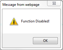
In a bid to protect their content from people copying and pasting text or saving images to their hard drive, website owners will use various tools to prevent users from accessing the context menu in their browser, thereby (in theory) disabling access to the “save as” or “copy” options. If you’ve ever visited a site and trying to right click it gives you a popup saying “Copyright Protected” or something similar, or if you simply cannot select content on the page with your mouse, you’ve run into a site doing this.
So What’s the Problem?
There’s a lot of reasons this kind of behavior on your site is a bad idea. Here’s a short list.

Don't do this to your customers.
- You cannot use the context menu. If you disable right-click in your web page your (potential) customer cannot access basic functionality of their browser, including, but not limited to:
- Opening a link in a new window or a new tab. Users who spend a lot of time on the web like being able to organize data in tabs while browsing. You’re taking away a basic tool for them.
- Copying text. Guess what happens when they can’t copy your phone number or email address to the clipboard? Here’s a hint: It doesn’t end with the word “paycheck”.
- Bookmarking your page. I guess you never want them to come back? And yes, they can do it via the main menu but I’ll promise you this: if they don’t normally do it that way, they won’t make an exception for you.
- It treats every customer as a criminal. You are basically telling everyone who accesses your site that you expect them to be thieves lusting after your content. The 99.9% of your visitors who only want to use the basic functions of their browser like tabs or copying an email address to the clipboard are given a nasty surprise.
- It’s obnoxious and rude. Don’t assert that much control over the user’s browser. It’s not your place. If you don’t want it to be copied or shared, the best solution is not to publish it at all- if you believe you’re protecting yourself from people who want to steal your content, you’re flat wrong.
- It doesn’t work. It takes very little effort to bypass a script or tool that disables the context menu. Note that this fact is not a justification for using it! The content has been sent to the user, and you have no control over it once that happens. Disabling these protections for someone who’s intent on doing it is the work of about 10 seconds. The only people you cause problems for are legitimate users.
- It doesn’t even slow down ACTUAL thieves. They don’t visit your site with a browser and save your content. Real content thieves are the ones aggregating posts on their sites for the purpose of drawing clicks for ad scams (among other things). You can’t stop them with a technique that relies on a client script because they’re not using a browser. They’re running software that visits your server, sucks down the content and does what they want with it. A chunk of JavaScript that displays “Right-click disabled” does absolutely nothing when the thief’s system doesn’t even use JavaScript. The person who’s going to steal your content is unaware that you tried to protect it. Not exactly good protection, eh?
In the end, using such tools says to your user that you suspect them of malicious intent with no good reason and inconveniences them, again for no good reason. If you are publishing content on the web, it is open for anyone to get ahold of- by design.
So What’s the Solution?
Don’t use tools that promise to protect your content via disabling right-click, obfuscating your site’s source code, using Javascript includes, preventing users from selecting text in the browser window or whatever. They don’t work and they serve no useful purpose aside from annoying potential users.
If you’re worried about people stealing your content, ask yourself this question:
Am I better off publishing this and risking it being copied, or not publishing it at all?
A very simple question, with a very simple answer. If the answer is you would prefer to not let it be copied at all, the answer is simple: Don’t publish it on the Internet, because you cannot protect it. In theory you could use lawsuits, DMCA notices or other legal techniques against someone who does steal your content- and you should know your rights, responsibilities and options in the case that someone does- but in the end you can’t prevent the actual act. You could punish it, but preventing it is functionally impossible and incompatible with an open Web.
If you’re worried about people stealing your images, you can use a few techniques to protect them. The easiest is to simply watermark them or put a logo on it somewhere unobtrusive. It can be a bit irksome to see that on every image you post, so give it some thought.
In Conclusion
This is the first post of a series I plan to write over time. There’s a lot of other “guidelines” I think people building a VO site (or any site, really) could benefit from knowing and simply haven’t been exposed to. Thanks for reading and I look forward to hearing your thoughts.
 I’m very pleased to announce that I’m currently recording Spinning Webs and Telling Lies, a collection of dark Western-themed short stories by David Niall Wilson and Brian A. Hopkins – both Bram Stoker Award Winners! I’m recording multiple short stories, each with its own theme and sound.


